Lou Dorfsman: Designer of the Golden Age of CBS
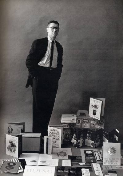
About a week ago I was very saddened to hear about the passing away of Lou Dorfsman. While Lou didn’t design the famous CBS eye (that was William Golden) from the 60s until the 80s he put the tiffany in the tiffany network. The CBS of today is but a shadow of what it was during that era, but back then it was one of three corporations that dominated American media and Lou gave them their signature look.
In my last year of art school my father purchased a copy of the book Dorfsman & CBS for me which showcased the entire career of Lou Dorfsman and it inspires me to this day. The first thing that you’ll notice is that most of what Lou does is in fact print design, and while he did do his share of animated titles and set designs it’s the medium at which he excelled. What I love about his work is that it’s not just about pretty pictures, but about using words and typography in clever ways to communicate his message. The other thing to keep in mind that as a creative director Lou was a manager, so what you’re seeing here is the word of many other talented people including typographers, photographers, illustrators and even printers.
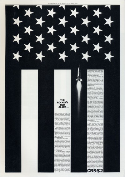
The first time I viewed this ad was in a course on the history of graphic design, and I was blown away! It’s a newspaper ad from 1962 showcasing the CBS News coverage of the John Glenn space flight. What makes it brilliant is that Dorfsman has taken the graphic convention of the american flag and by turning it 90 degrees and adding a rocket made it represent the hopes and aspirations of the space program. Simply put this is conceptual graphic design at its best.
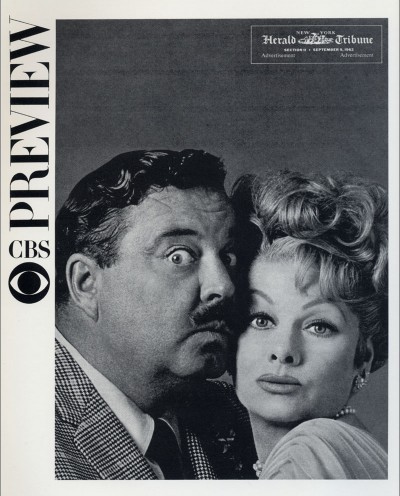
Cover of a newspaper advertorial designed by Lou Dorfsman from 1962 which introduced the new fall schedule which included comedy greats Jackie Gleason and Lucille Ball. I grew up watching Gleason and Ball in reruns, but when you see them together on this cover you get a feeling for the power of CBS as a ratings dynamo. Also notice the wonderful use of negative space in the layout which makes the photo even stronger.
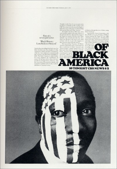
This is a newspaper ad designed by Lou Dorfsman from 1968 for a series on black history. Dorfsman has taken the american flag and uses it as a graphic device to show division in the nation and the struggle for civil rights which was being played live on television.
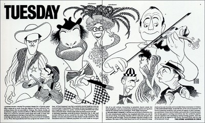
Here’s a two page spread from a newspaper advertorial designed by Lou Dorfsman from 1963 which introduced the new fall schedule. The illustrations are by the legendary caricaturist Al Hirschfeld.
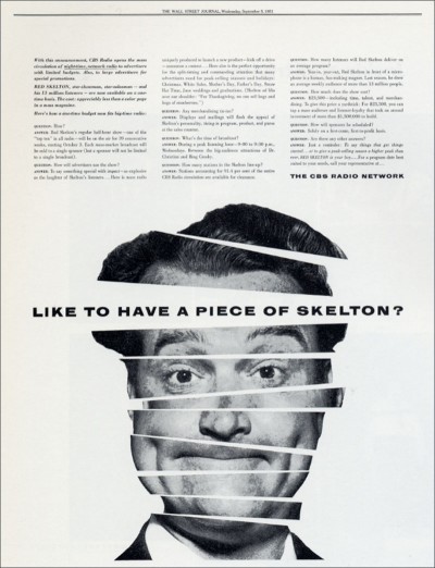
This is a 1951 newspaper ad for the Red Skelton radio show designed by Lou Dorfsman. The concept behind the ad was that an advertiser could just buy a single spot on the show instead of sponsoring the entire program. This ad was designed when Lou was just getting started. What I like about is that many graphic designers might have thought “it’s just a trade ad selling advertising, who cares?” However Lou has taken this wonky topic and made it into something both smart and graphic striking. Over 50 years later the design of this ad still shines.
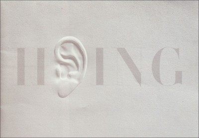
This is a page from an early 50s brochure designed by Lou Dorfsman to promote buying advertising on radio which was then be encrouched upon by the new medium of television. In my many years as a designer I’ve seen embossed printing as a gimmick to dress up bad design (example: a poorly done wedding invitation) but here Dorfsman is taking the technique and making it speak.
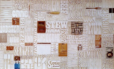
Lastly this is the famous CBS cafeteria mural designed Lou Dorfsman. Lou based the idea on a printer’s typecase of lead type. Here’s a wonderful video that tells the story of the mural:
Sadly the mural fell into disrepair over the years but there’s now a fund to restore the wall to its former glory.


