


Paripo Umachoko
Posted by Michael Pinto on Jul 30, 2007 in Hobbies and Collections |
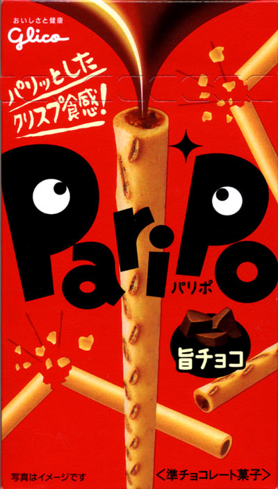
The typography on this package design is A+ in my book! Having the eyeballs on the letters P reminds me of something that designer Paula Scher might create. I was also impressed that the treats inside tasted rather good, the outside had a crisp feeling to it which was a nice contrast to the sweet chocolate goo inside. How often do you get to have a good typography and chocolate experience for $1.89?