Hi-Ho Silver! Thor & the Cap’n Have Logos

I’m a journalism major, not a design major, but I have to say that the logos for the upcoming film adaptations of Marvel comics’ Thor and Captain America are…less than thrilling. And I mean that in the literal sense. They’re pretty boring. Let’s have a look-see.

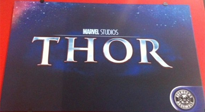
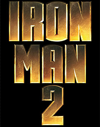
Starting with Thor…look, the guy has a winged helmet and a giant hammer that controls lightning, and you went for nothing more than a basic textured and beveled font? Come on; the guy isn’t one of the biggest names in comics (relative to Batman, Superman, etc)! I guess it kind of works if you juxtapose it against Iron Man 2’s logo, which was also a simple text with texture. Except…

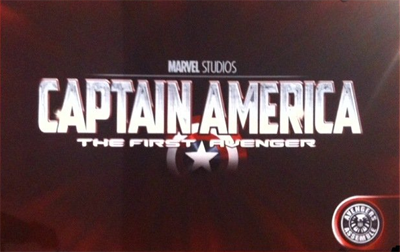
Bam! Captain America and Thor both have silver logos, while Iron Man 2 was that sort of sandy-gold (see below). Sure, Iron Man was one of the original five members of the Avengers in the comics, but so was Thor; why the distinction? Because Iron Man is such a maverick?
Maybe it was something intentional, maybe it was just a coincidence. Either way, neither logo is particularly attractive or outstanding. Then again, neither was Iron Man 2’s…
Gia Manry is a professional writer specializing in geek culture. She currently writes primarily for Anime News Network, but also likes being followed on Twitter. She can be contacted via her website.


