Posted by Michael Pinto on Jul 7, 2008 in Pulp Fiction
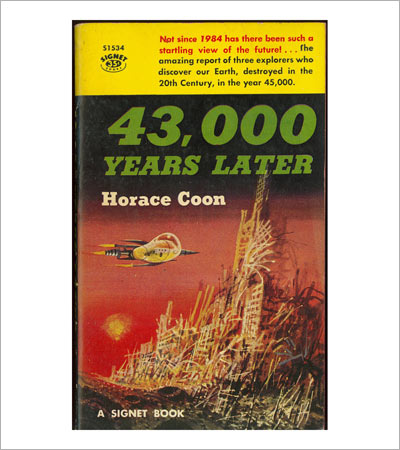
Oh sure anyone can wrote about the world 100 years in the future, but this 1958 novel 43,000 Years Later by Horace Coon attempts to explore the year 45,000 from the point of view of explorers visiting Earth after it was destroyed in the 20th Century.
Sadly I couldn’t find a good bio of Horace Coon on the net, however I did come across a few other titles that he may have been the author of: Triumph of the Eggheads from 1955 which is a non-fiction title on intellectuals in American government (ah yes! the good old days) and American Tel and Tel: The Story of a Great Monopoly which was published in 1939. It’s ironic how these mid-20th century themes of nuclear proliferation, the importance of smart government and the financial power of telecommunications are still very much topics that are still in style.
The abstract looking illustration is by Richard M. Powers who did quite a few pulp covers that were very heavily influenced by surrealistic and dadaistic artists like Max Ernst. What I like about his work is that it’s a nice break from the realism that you see in so many pulp covers from the 30s through the 50s — Powers is daring to do a science fiction book cover in a modernist art style, which would become a bit more popular in the 60s (although is sadly out of style with unimaginative publishers today). By the way if you like the cover you can buy a copy of The Art of Richard Powers at amazon.com. A nice personal account of the life of Richard Powers can be found here.
Posted by Michael Pinto on Jun 22, 2008 in Pulp Fiction
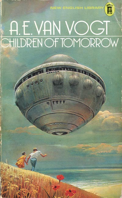
What’s great about this cover us that the couple in the foreground seem to be oblivious to the giant spacecraft above — the proof of this is that they’re running to the spaceship rather than from it:
Posted by Michael Pinto on Jun 20, 2008 in Pulp Fiction
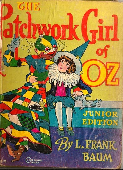
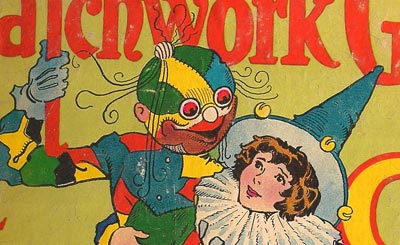
There’s something very innocent yet creepy about this 1913 cover illustration by John R. Neill for the book The Patchwork Girl of Oz by L. Frank Baum. If you look closer at the artwork what’s interesting is that the little girl doesn’t seem the least bit disturbed by this doll that has come to life and I also love the little touch of the multichromatic creature grabbing the typography of the book’s title:
Posted by Michael Pinto on Jun 17, 2008 in Pulp Fiction
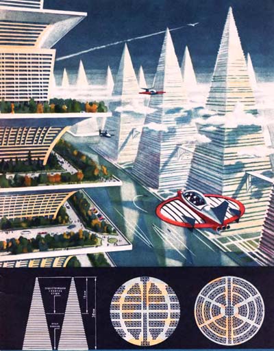
The funny thing is that although this Soviet city of the future seems utopian, it’s very repressive under the surface: Every building in site looks exactly alike! It’s as if in this vision of the future there is only one architect who designed just one building and then they figured out to leave well enough alone after that point. Also notice how all the vehicles carry multiple parties — clearly mass transit rules the day, but if you want to own a private car jet that’s too bad! The illustration is scanned from a 1969 copy of Teknika Molodezhi (Techniques of Youth) magazine which was a Russian Popular Mechanics magazine of sorts.
Posted by Michael Pinto on Jun 2, 2008 in Pulp Fiction
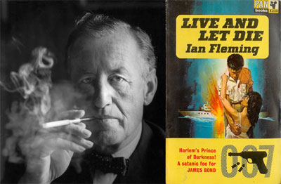
There’s a great article by Charles McGrath at the New York Times on Ian Fleming the author of the James Bond books (his 100th birthday will be on Wednesday). I love how the article goes into detail on the difference between the print and film versions of the series:
“Albert R. Broccoli, a producer of the first 17 Bond films, could be said to be a co-creator of this other, meta-Bond. It was he or his writers who made a trademark of the “Bond. James Bond” line, for example, and who insisted on the “shaken, not stirred” business. Fleming’s Bond is not nearly so fussy about what he drinks, as long as there is plenty of it. He’s as apt to slug down bourbon as a martini. This Bond is also much more fetishistic about smoking than he is about drinking and makes a point of ordering his cigarettes (with three gold bands on the filter) from Morlands of Grosvenor Street. (In a pinch, though, he’ll also smoke Chesterfield kings by the carton, and it’s little short of miraculous that he can climb a flight of stairs, let alone swim for miles, as he so often does.) He likes fast automobiles but hates gizmos, except for the odd concealed knife, and wouldn’t get caught dead with the laser watches, ejector seats, tricked-out cars and exploding key chains the movie Bond has been kitted out with, not to mention that embarrassing jet pack.”
Posted by Michael Pinto on Apr 24, 2008 in Pulp Fiction
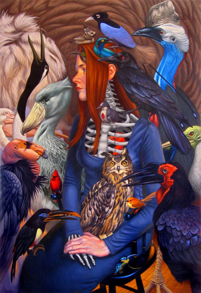
While wandering around the art show at the Lunacon science fiction convention (back in March) I came across the above painting by Craig Maher and was blown away. Looking back at it I think it was the best work in the entire show — to be fair the above image doesn’t do the actual painting justice. For starters the scale of the painting is much larger (21″ by 31″) and features some amazing detailed brush work, most noticeably on the feathers of the birds. Maher’s use of lighting and color is also amazing too, the surface had an almost iridescent quality to it. And then there is the subject matter itself: In a room crammed full of everything from spaceships to dragons, Maher doesn’t resort to the unknown or unexplored — yet the paining has a very surrealistic quality to it which makes it other worldly.
Posted by Michael Pinto on Apr 21, 2008 in Pulp Fiction
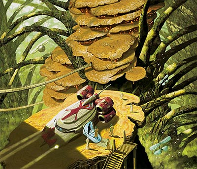
While visiting the Lunacon science fiction convention (back in March) I had a fun time wandering around the art show. It was there I came across the imaginative artwork of Stephen Youll who grew up and learned his craft in England and now resides Stateside. Youll works on a wide range of genres from fantasy to mystery, but my favorite paintings of his are his exotic landscapes that feature spacecraft. His painting sort of invite you in to a landscape that you’d want to hang around and maybe catch some adventure while you’re at it.
Shown above is an illustration for A Forest of Stars from 2002. Below are illustrations for Scattered Suns from 2004, and The Dragon in the Sea from 2006. In all three illustrations you can see how Stephen Youll gives the viewer a wonderful sense of scale while giving you a good taste of the local atmosphere through his use of color, lighting, and textures.
Posted by Michael Pinto on Apr 17, 2008 in Pulp Fiction
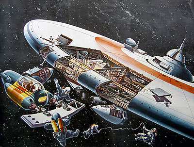
Shown above is a 1963 painting of a space station by German illustrator and futurist Klaus Bürgle. Bürgle was born in 1926 in Stuttgart and started illustrating magazines in 1953. He focused on technical and scientific illustrations and did quite a bit of work for the publicationDas Neue Universum.
Below is an illustration of a future subway system from 1967 and a 1959 painting showing traffic of the future:
Posted by Michael Pinto on Mar 22, 2008 in Pulp Fiction
I always associate solar energy and futurism with the 70s, however this magazine ad from 1958 (just think of it — that’s fifty years ago!) shows off a rather stylish solar home of the future. I love the little touches of the indoor swimming pool and the orange jet car parked outside.
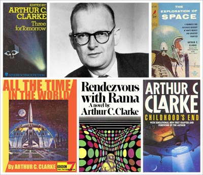
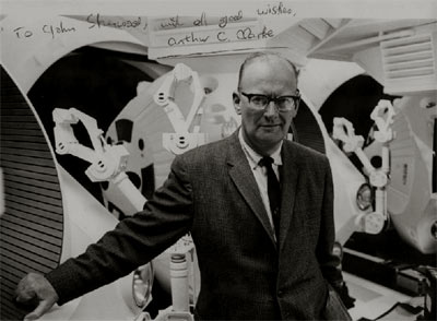
Posted by Michael Pinto on Mar 18, 2008 in Pulp Fiction
Today Arthur C. Clarke passed away: What I always admired about Clarke was that he started life as a fanboy reading science fiction pulp magazines, in fact he got his first few stories published in fanzines between 1937 and 1945 (he didn’t turn pro until after WW II at the age of 29). Also for him science fiction wasn’t some far off fantasy, but rather a reality waiting to happen — the proof of this was his love of science and astronomy, which gave his fiction a sense of credibility. Here is video of Clarke reflecting on his 90th birthday from last December:
Posted by Michael Pinto on Feb 6, 2008 in Pulp Fiction
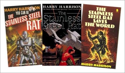
Tomorrow marks the start of the Chinese New Year, so we’re exploring fanboy themes relating the Year of the Rat. Our pulp fiction pick to celebrate the new year is the series of science fiction books on the Stainless Steel Rat by Harry Harrison.
If you like anti-heroes you’ll love the Stainless Steel Rat .The series features James Bolivar diGriz a futuristic con man who is an expert in the martial arts and a master of disguise. He many aliases including “Slippery Jim” and “The Stainless Steel Rat” and has an odd code of ethics, for example he’ll be more than glad to steal but will never kill anyone. He justifies his crimes by arguing that he is providing society with entertainment.
The character of the Stainless Steel Rat first got his start in the 1957 issue of the science fiction pulp magazine Astounding. The first novel was then published in 1961 and today there are over ten books in series including spin-offs like choose your own adventure books and a board game. There was talk of a movie but it hasn’t happened yet…
Posted by Michael Pinto on Jan 5, 2008 in Pulp Fiction
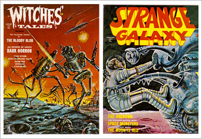
Shown above are the covers for Witches Tales from August 1971 and Strange Galaxy from February 1971. They’re part of a wonderful collection on Flickr put together by Shawn Murphy:
“Welcome to the strange and gruesome world of EERIE PUBLICATIONS. These magazines were cheap knockoffs of the more popular CREEPY and EERIE magazines put out by Warren Publishing. These are some of the most insane, bloody and violent magazine covers you will ever see. Ever since I saw my first one I’ve been obsessively collecting them. This is a large sampling, but I still need many more. I hope you enjoy them as much as I do!!!”
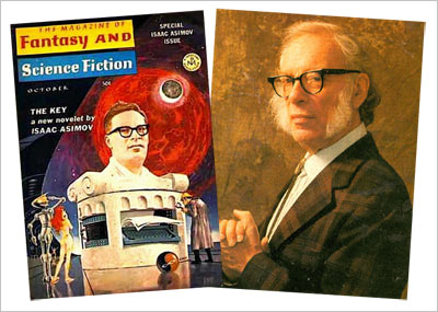
“One of the most prolific writers in history, on any imaginable subject. Cared little for art but created lasting and memorable tales.”
This made me rather happy on a silly level as I grew up reading the Foundation series and chaired a small science fiction convention on Long Island in the 80s that had Asimov as a guest of honor. Although credit for getting him as a guest has to go to Elyse Rosenstein who was very involved in organizing the Star Trek conventions in the 70s and the Lunacon science fiction conventions in the 80s.
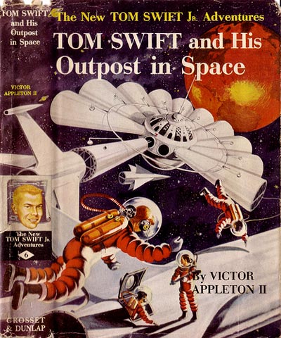
Posted by Michael Pinto on Oct 19, 2007 in Pulp Fiction
I love the sense of scale in the illustration above cover for Tom Swift and His Outpost in Space from 1955 which I found thanks to the Flickr site of digital archivist Paula Wirth. The illustrator who did the cover is (it may be Graham Kaye who also did quite a bit of work for the Saturday Evening Post. I also come across this gem of a description of the book from the dust jacket:
“A space station 22,300 miles above the earth is Tom Swift Jr.’s latest project! Tom’s plans for his gigantic hub-and-spoke outpost of the universe calls for twelve laboratories. Solar batteries will be produced in one laboratory, another will be a celestial observatory, and another a radio broadcasting and TV station relaying programs over one third of the earth. But the project is beset from the start by a fiendish enemy, and also that weird phantom of outer space, Zero Gravity.”
Posted by Michael Pinto on Oct 12, 2007 in Pulp Fiction
Shown above is a vivid yet lush illustration of Shakespeare’s The Tempest by Sam Weber who is based in New York City. His portfolio is well worth checking out as it has a wonderful mix of surrealism, horror and whimsy. Also as a graphic designer I also love how Weber incorporates typography and abstract design elements into his artwork.
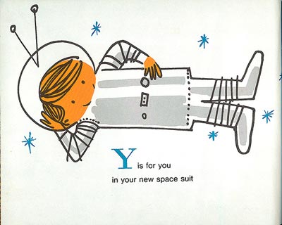
Posted by Michael Pinto on Oct 4, 2007 in Pulp Fiction
Ward Jenkins is a very talented illustrator who hails from Portland, Oregon. Recently on his Flickr feed I discover an amazing set of scans he uploaded of the book Space Alphabet (1964) by Irene Zacks, which features some amazing artwork by Peter P. Plasencia. I did a quick bit of searching for a bio of Mr. Plasencia and found this:
“Peter P. Plasencia is a native New Yorker. He is married and has one daughter, Regina. He majored in industrial design at Pratt Institute, studied at the Meschini Institute in Rome, and at the Art Students League in New York. Mr. Plasencia is now head of his own design house. Among the children’s books he has illustrated are In The Deep Blue Sea, Magic Mixtures: Alloys and Plastics, and The Chemistry of a Lemon, all published by Prentice-Hall.”
Posted by Michael Pinto on Sep 8, 2007 in Pulp Fiction
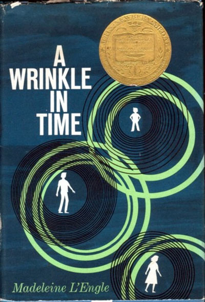
On September 6, 2007 Madeleine L’Engle passed away. For many a young fanboy (and fangurl) Madeleine’s novel A Wrinkle in Time served as a early introduction into the world of science fiction. She wrote the book between 1959 and 1960, but after at least 26 rejections from publishers the book came out in 1962 and went on to win many awards and serve as an inspiration to generations of kids. Thank you Mrs. Madeleine!
Posted by Michael Pinto on Sep 4, 2007 in Pulp Fiction
Shown above is the Chesley Awards winner of the best hardback cover illustration which is awarded at Worldcon each year by the Association of Science Fiction & Fantasy Artists. The artwork is for the cover of the book River of Gods, and the talent behind the painting is Stephan Martiniere. For me the real test of artwork with a fantastic theme is if I would want to step into the painting and explore the world being show, and in this case Martiniere has created a very inviting world with a wonderful sense of scale and architecture.
Posted by Michael Pinto on Jul 7, 2007 in Pulp Fiction
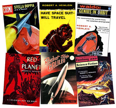
Today is the 100th birthday of science fiction master Robert A. Heinlein who was born in July 7th, 1907 and passed away in 1988. As a dyslexic youth I always prefered to watch science fiction on television rather than read it, but I have to say that reading Heinlein was always a great pleasure for me (my favorite is the Moon is a Harsh Mistress). What’s also enjoyable about his work is that even while you may not always agree with his point of view, his writing always makes a great conversation starter with fellow fanboys and fangurls.
By the way shown above are various covers from from both books and pulp magazines featuring Robert Heinlein, if you’d like to see more go and check out the Heinlein Book Cover Museum.
Posted by Michael Pinto on Apr 27, 2007 in Pulp Fiction
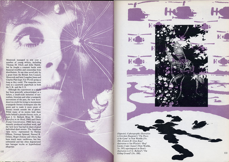
Shown above is an editorial spread (click to see at full size) from ‘The Science Fiction Book: An Illustrated History’ by Franz Rottensteiner, published in 1975. The book went into great detail on almost every major theme that could be found in science fiction, including the more far out authors of the era like J. G. Ballard and Michael Moorcock.
Seen on the left is a photographic illustration to Gretchen Haapennen’s ‘The Pieces of the Game’ in New Worlds #184. Shown on the right are illustrations by R. Glyn Jones (center) superimposed over an illustration for J. G. Ballard’s ‘The Killing Ground’.
Posted by Michael Pinto on Apr 17, 2007 in Pulp Fiction
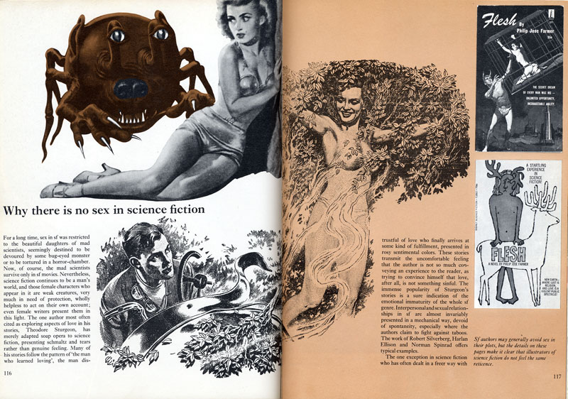
Shown above is an editorial spread (click to see at full size) from ‘The Science Fiction Book: An Illustrated History’ by Franz Rottensteiner, published in 1975. The book went into great detail on almost every major theme that could be found in science fiction, including sex (or a lack there of). I love caption they have in the lower right hand corner:
“SF authors may generally avoid sex in their plots, but the details on these pages make it clear that science fiction illustrators do not feel the same reticence.”